
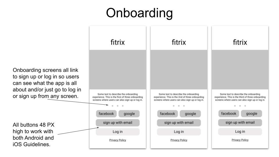
Fitrix is a responsive web app designed with mobile-first design. It is designed to make fitness fun and accessible to all, with beautiful imagery and fun, manageable workout videos.
Here is the high-fidelity clickable prototype for Fitrix. You can also scroll and read below to learn about my process while working on this project.
For this project, I worked on exploration of composition and layout of a Fitness app from a UI perspective. Once I had solidified the foundations of the app through low and mid-fidelity wireframes, I took the project to completion by diving into the high fidelity visual designs for Fitrix. This project explored aspects such as typography and color, icons, imagery, and interactions. The final project is a responsive web application that is designed for different breakpoints and ready for handoff to developers.
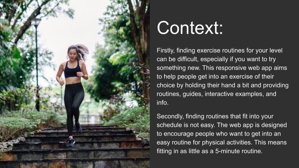
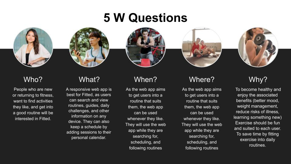
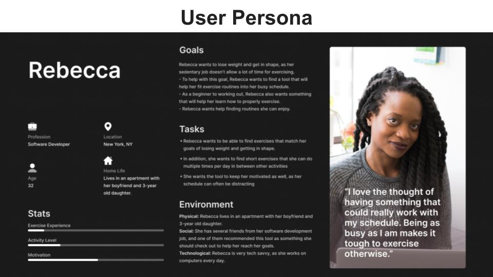
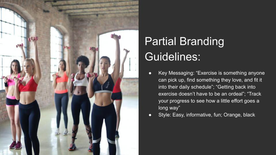
For this project in particular, some of the UX was completed before I started on the project, so my primary role was that of UI Designer. However, there was still some exploration and UX involved in the early stages of this project for me. Here is the context I was given at the beginning of the project in order to get me started:
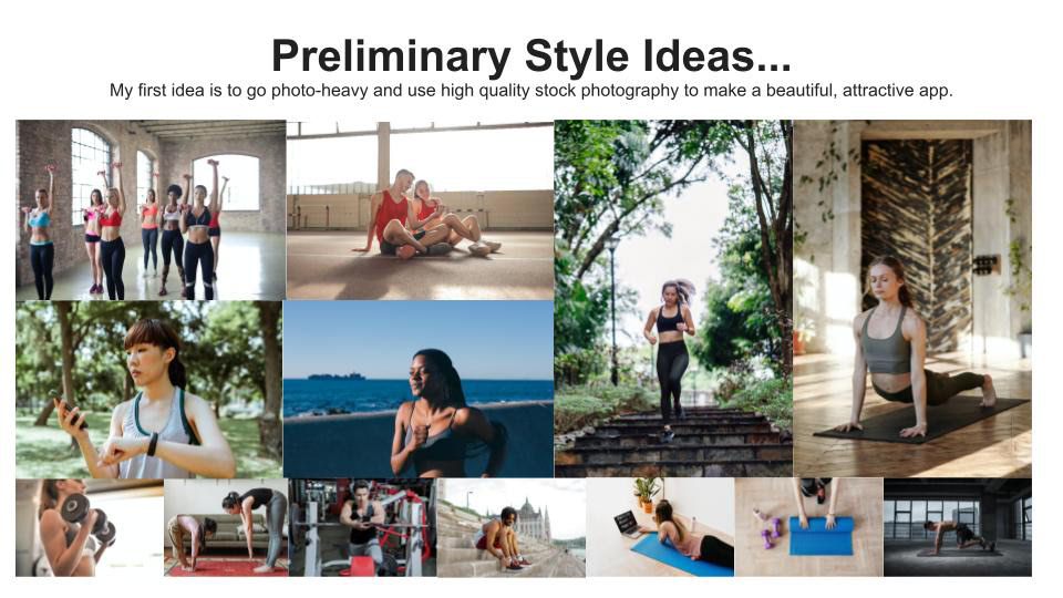
When starting this project from a UI perspective, it was important to get a good sense of the look and feel that I might want the app to have. My first thoughts immediately went to using beautiful photography and imagery that shows the kinds of workouts and activities that people might be doing when using this app.
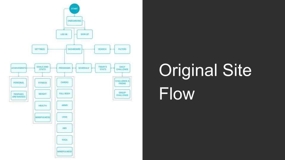
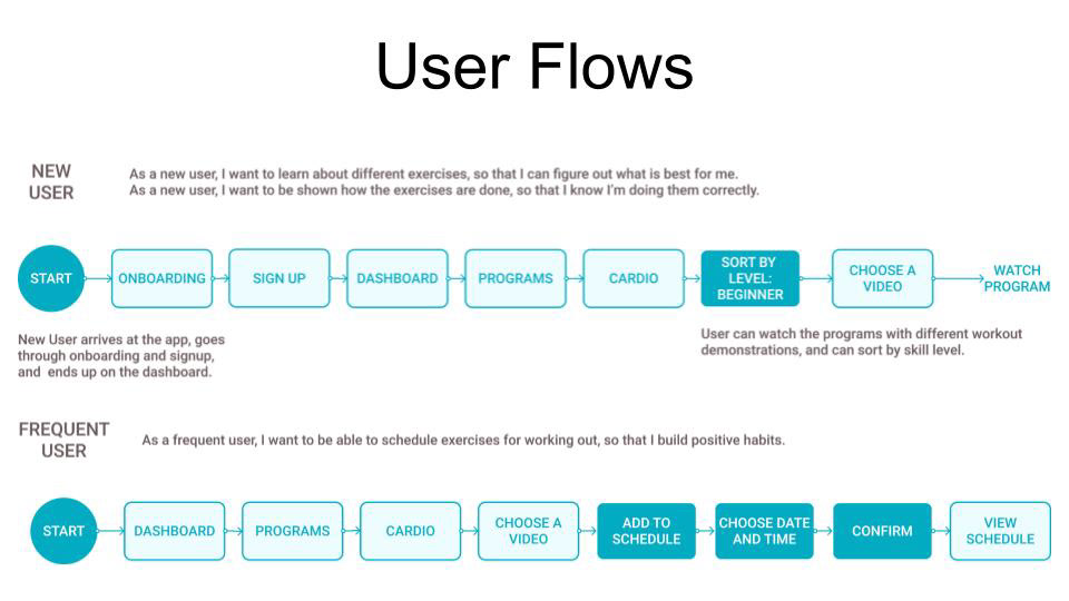
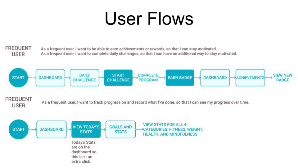
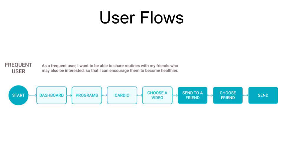
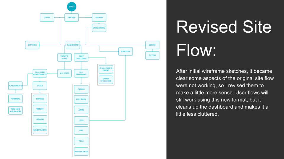
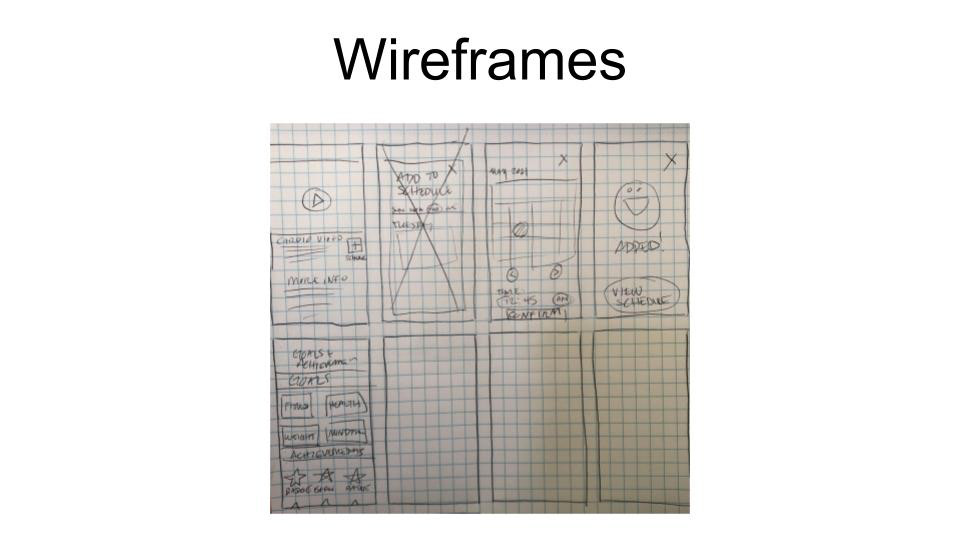
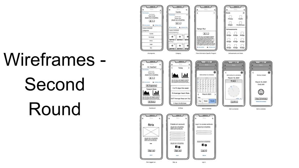
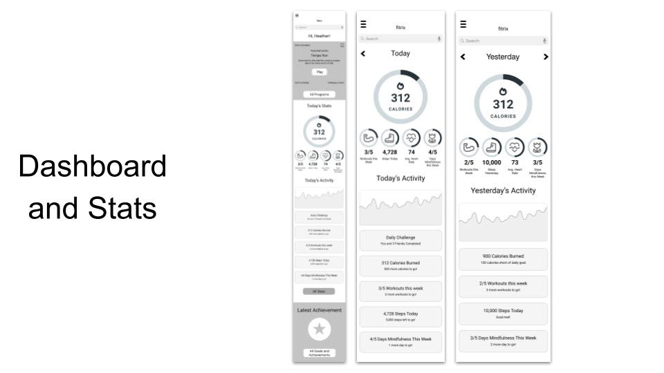
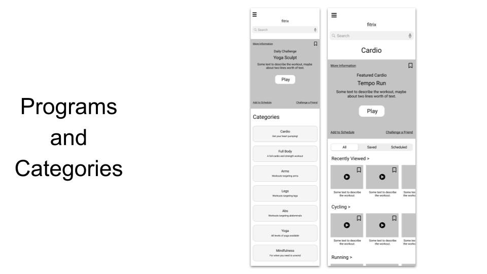
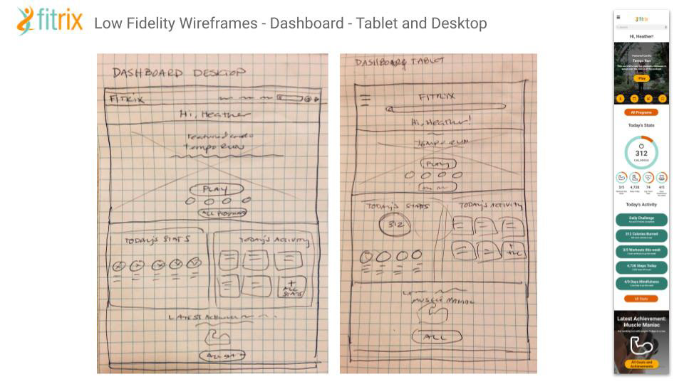
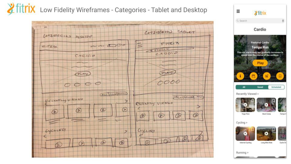
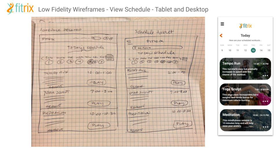
Next steps for me were to get a good sense of the user flows on the site, so I would know which screens needed to be designed and how those screens might flow for the user. I created these user flows, then started off by sketching out some rough wireframes. based on those initial wireframe sketches, some aspects of the original site flow were then edited to make a little more sense to the user. It also helped me to clean up the dashboard of the app and make it cleaner and less cluttered, therefore more user-friendly.
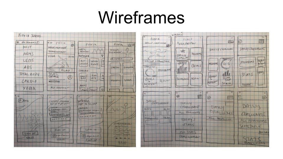
Here are some of the wireframes that I sketched while figuring out those initial flows.
Responsive Layouts and Grids
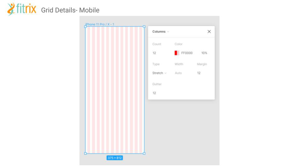
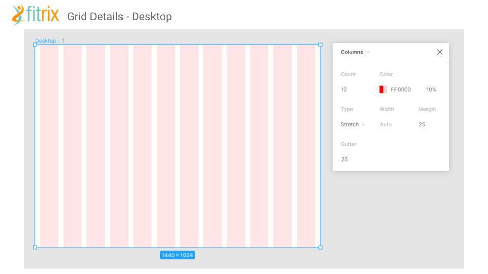
The next steps were to work on a grid structure for the app. Since I was designing with mobile-first in mind, at this point in the project I focused on designing my grids for the mobile designs.
The below images display the grid structure and how it applies to the app.
UI Elements and File Organization
For this task, I had already completed much of the planning in regards to UI elements, so for this exercise I focused on revisiting my designs and re-evaluating the design decisions I had previously made to see if there were areas of improvement that could be implemented. After reading through the exercise, I discovered a number of areas of improvement in the designs which I implemented.
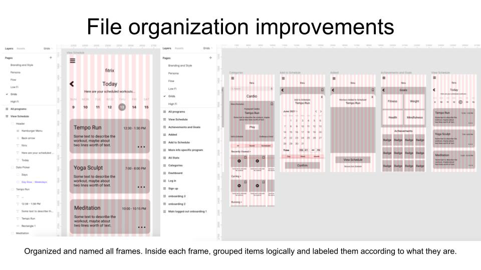
I also spent some time going into my Figma file to align and group elements together and to label items and files in order to make it easier to navigate through the file and discover elements. This organizational system will make it easier to find elements in the file when working on improvements in the future. The file is highly sharable as Figma allows team members to seamlessly work together on a single file.
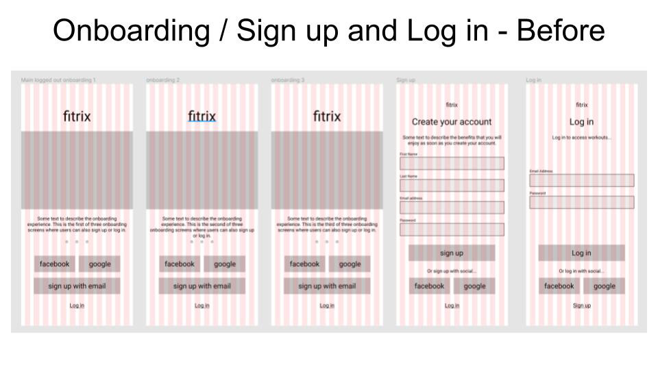
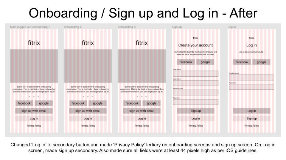
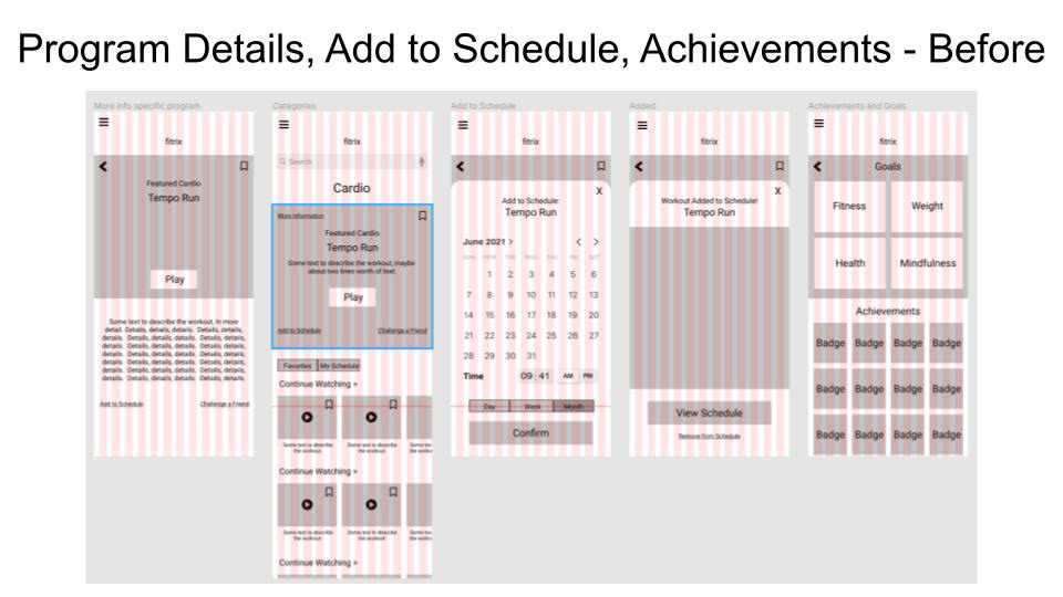
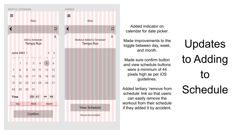
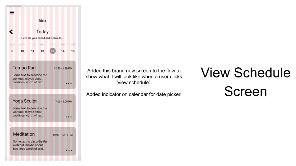
The below images demonstrate the changes I made at this stage.
The below images demonstrate the changes I made at this stage.
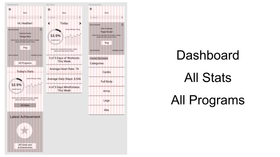
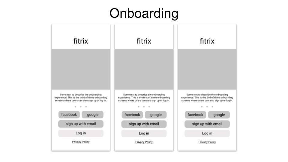
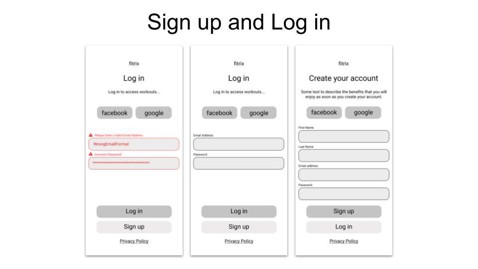
Visual Hierarchy and Spacing
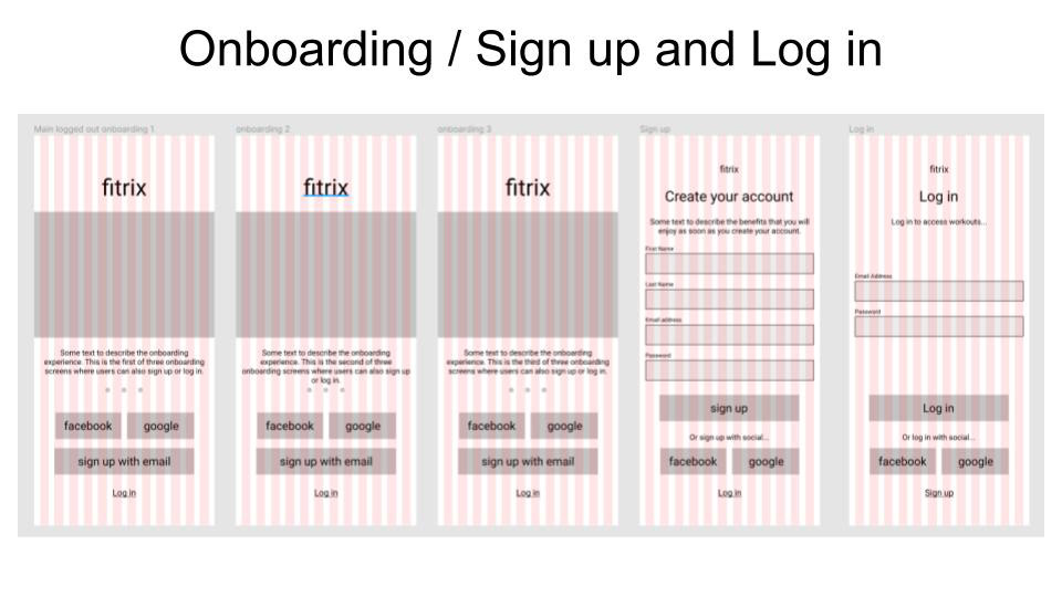
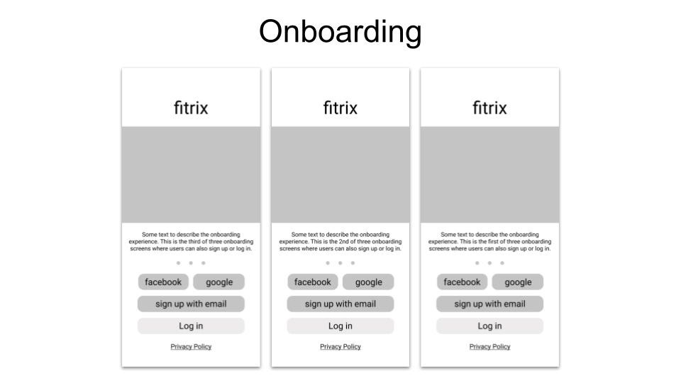
At this step, I applied the principles of spacing and visual hierarchy to my grayscale wireframes. To do this, I started by considering the key actions I wanted users to take and the messages that I wanted to communicate on each screen. This helped me to understand better what should be emphasized the most. With this in mind, I made sure to apply sizing, contrast, boldness, positioning, and spacing in a strategic manner in order to iterate on my previous wireframes. Once visual hierarchy was established, I went on to further refining the design through good spacing. You can see some of the work I completed at this stage in the below images.
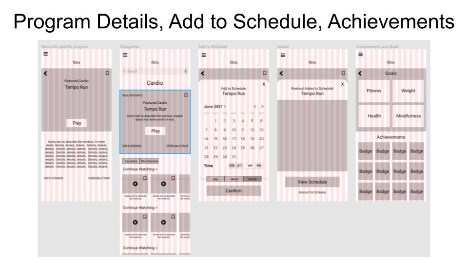
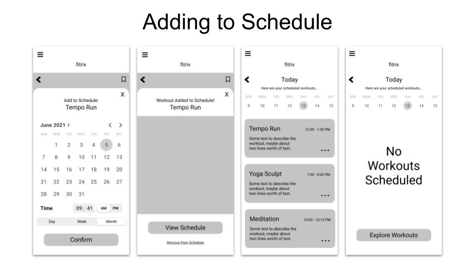
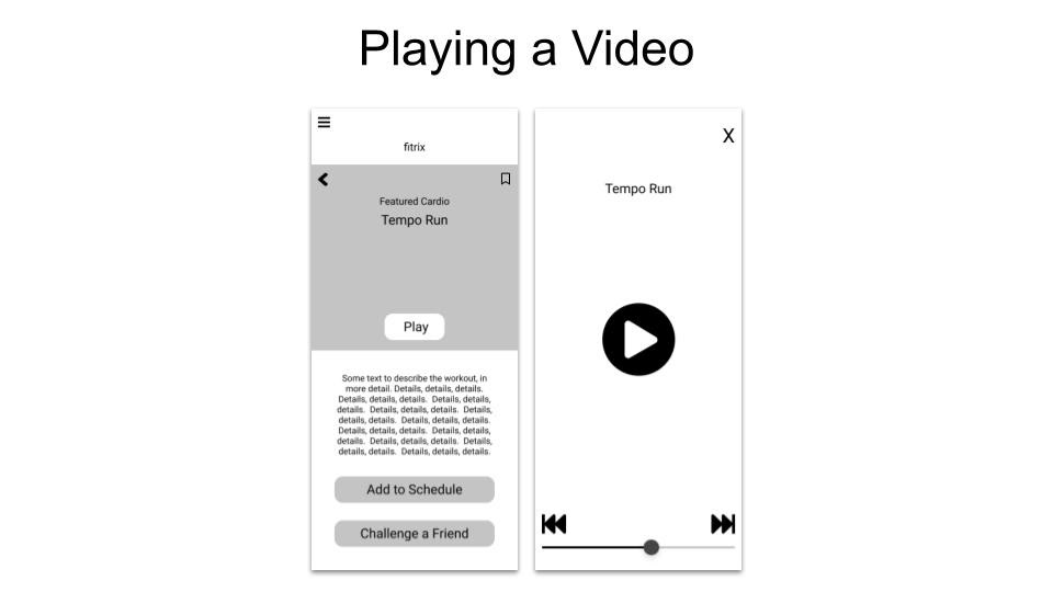
UI Design Patterns
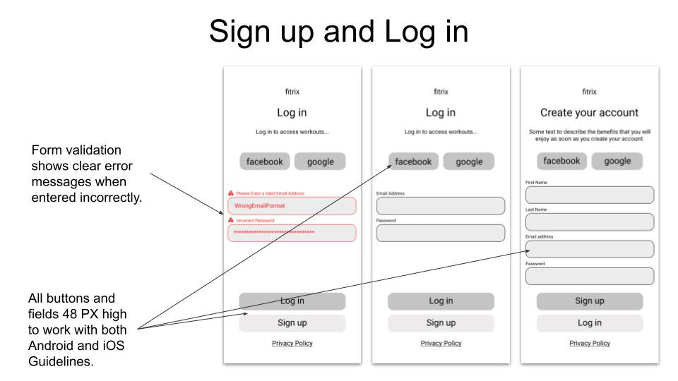
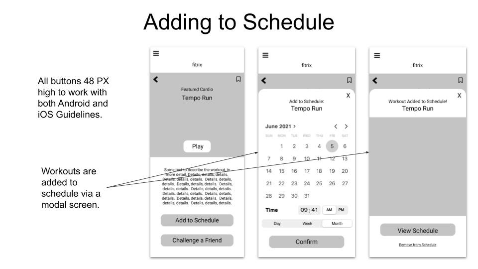
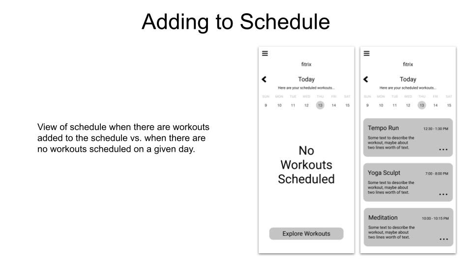
At this stage, it was important to make sure the wireframes displayed best-practice UI Design patterns. In order to do this, I researched design patterns for possible solutions to the problem of helping users to complete the actions that are most important in the app. Once I researched good solutions to these problems, I applied them in the wireframes and you can see in the below images in order to help the navigation of this app to be clear.
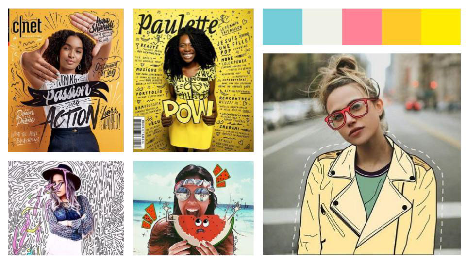
Mood Boards
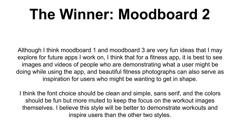
An important (and fun) stage of the UI process is the creation of mood boards. The purpose of this exercise is to compare different possible visual directions for the web app. It is the final building block that is needed before beginning to add the high-fidelity design to the wireframes. At this stage, it is important to carefully consider visual design principles and accessibility considerations in order to choose the best visual direction.
Here are the different mood boards I explored at this stage of the project...
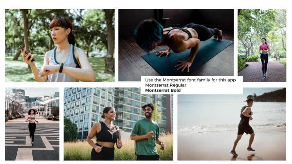
Mood Board #1
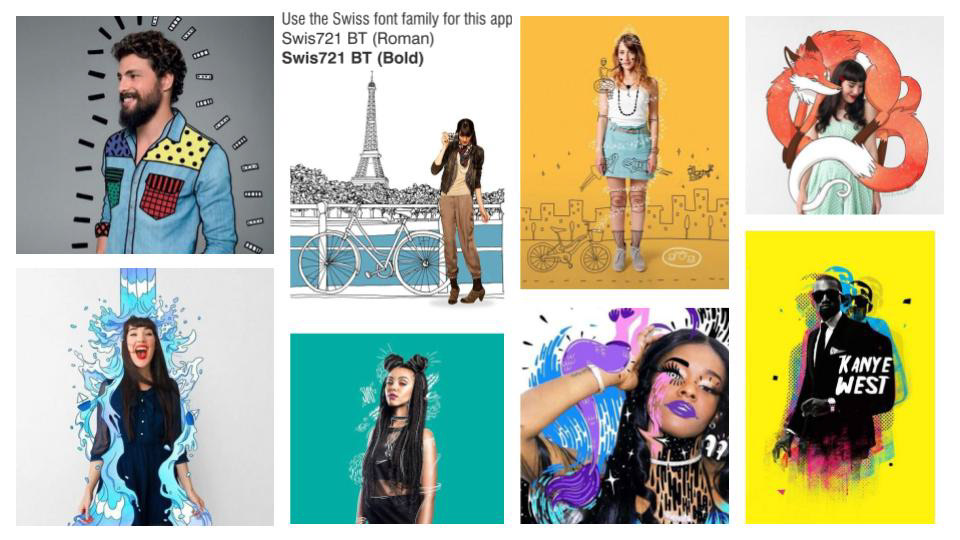
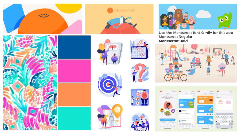
Mood Board #2
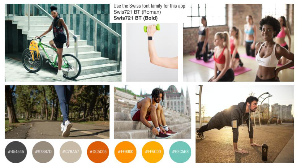
Mood Board #3
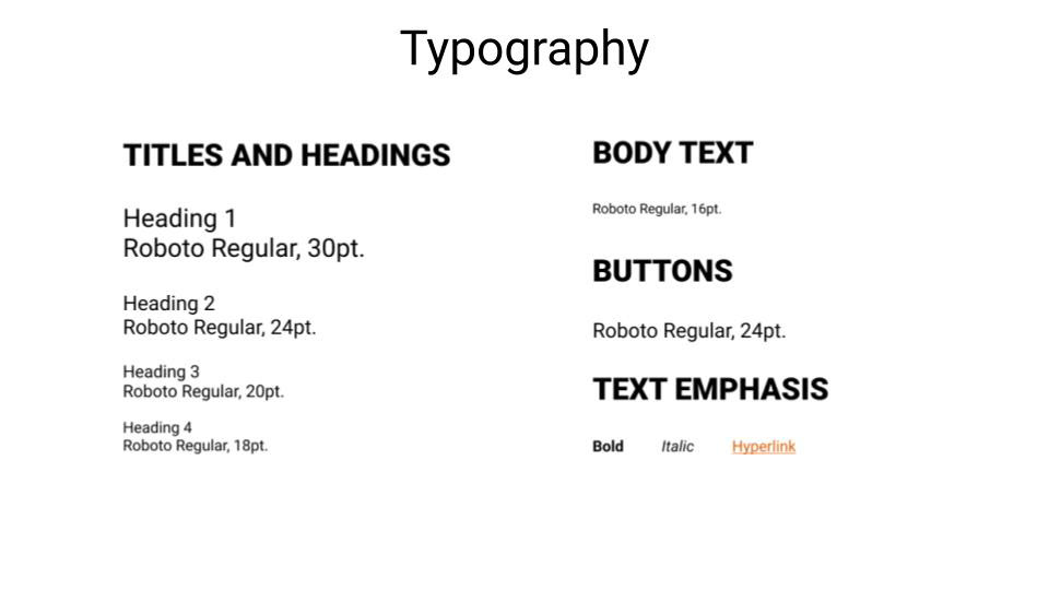
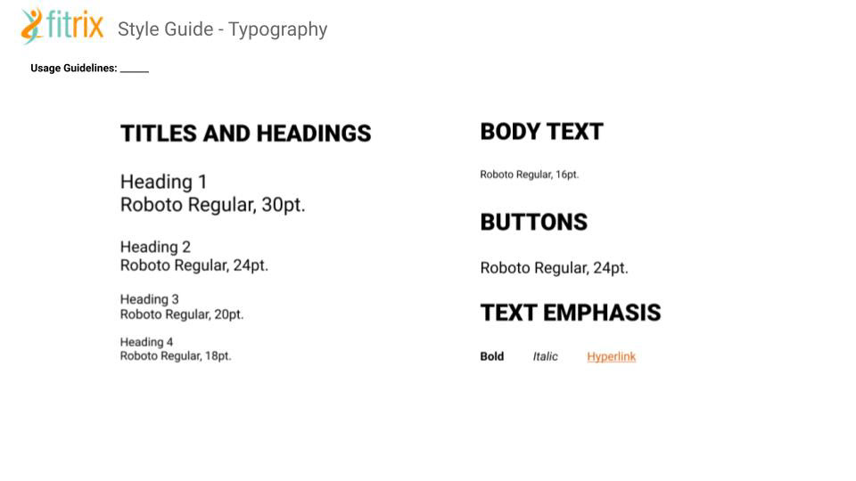
Typography in UI
After the visual direction was established, the next step was to establish the typography direction. Here is the typography I decided upon for this app...
After deciding on a font to use, I applied that font throughout my prototype in order to better represent what the app will look and feel like in it's final form.
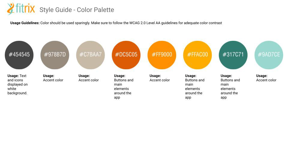
Color in UI
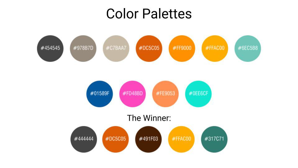
Just as typography is important to establish in the UI process, color usage is equally as important. I knew that I needed to incorporate orange into the app due to the initial guidelines, so I focused on color palettes that worked well with orange. I tried out several different combinations, but my final choices worked well together visually, but also passed ADA guidelines on the WebAim color contrast checker.
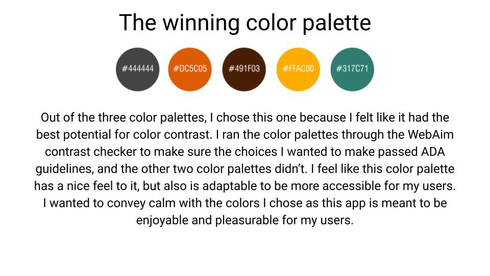
After the color palette was established, I went about applying those colors to the app and establishing a visual direction.
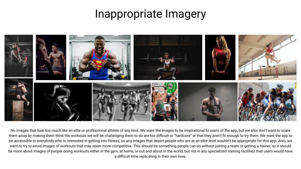
Imagery in UI
After the colors were established, it was important to establish the imagery guidelines. You can click on the below images to enlarge them and read more about my rationale for what constitutes appropriate vs. inappropriate imagery.
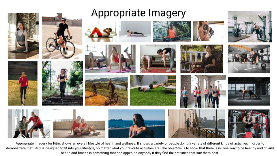
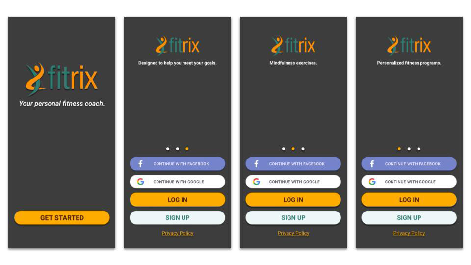
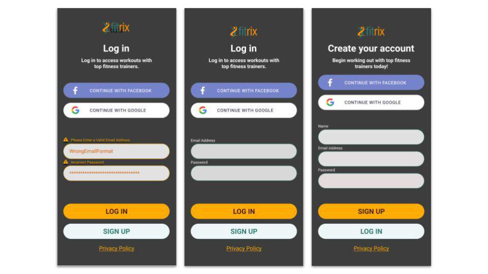
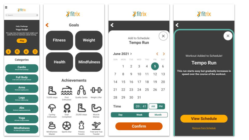
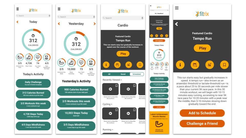
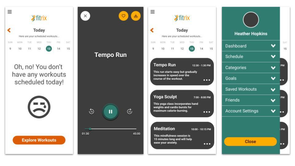
Once the image guidelines were established, I went about applying those imager to the app in order to bring it to life. You can see those images below.
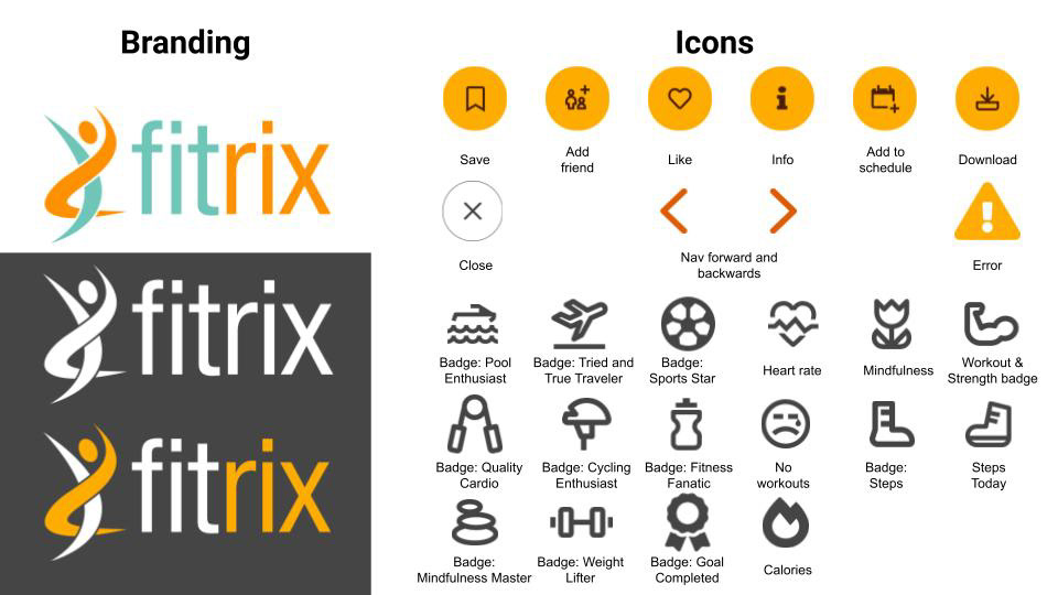
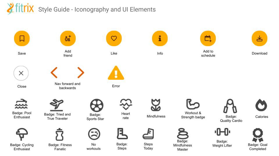
Shapes and Icons
I sourced and created a set of icons for Fitrix at this stage of the project. I made sure to do some research on appropriate images and icons used for responsive web applications, and had fun creating a suite of icons for the dashboard and badges in the Fitrix app.
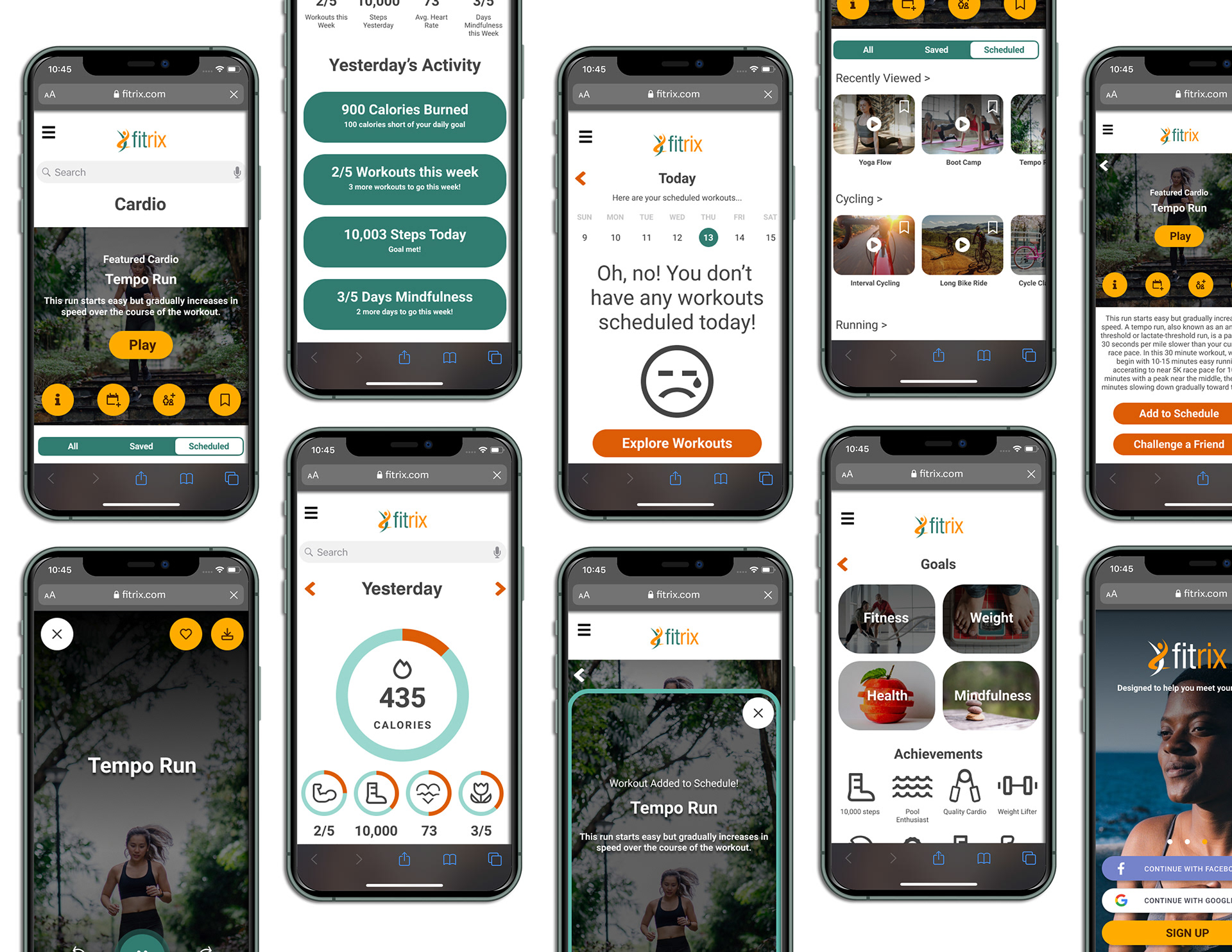
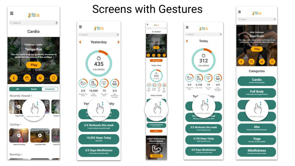
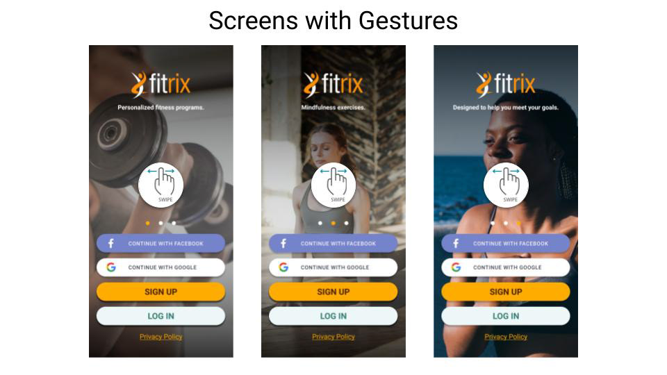
Interactions and Gestures
In today’s apps, interaction and animation have become a huge part of the experience, and they help direct and engage users as they explore an app or website. So, at this stage of the project, I made sure to define the kinds of gestures and interactions that a user might have while engaging with Fitrix.
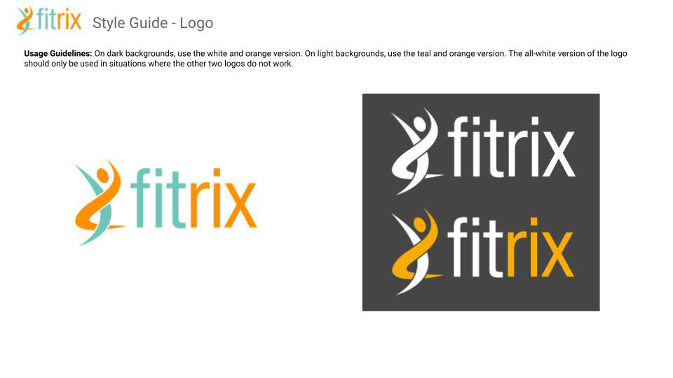
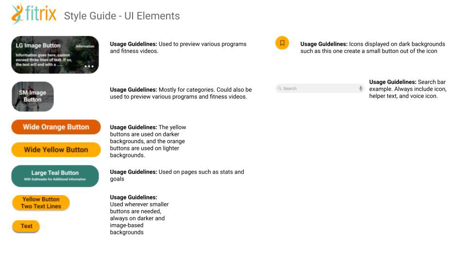
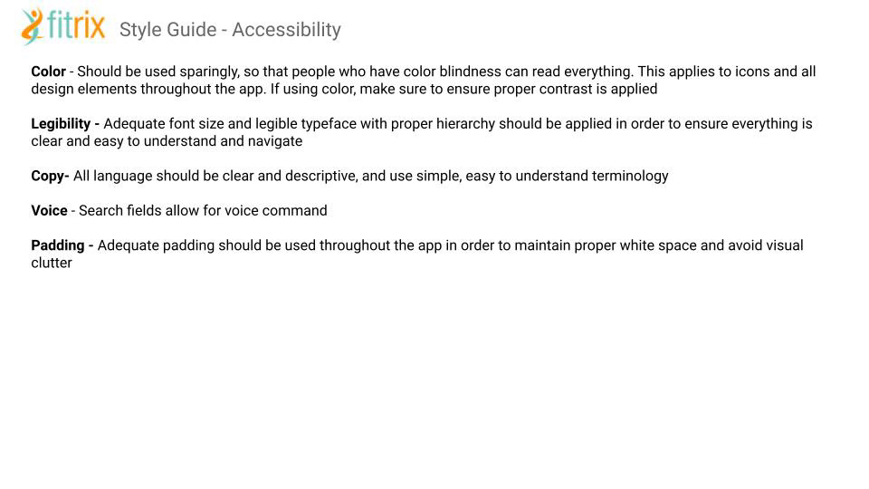
Style Guide
At this stage, I was nearing completion on the app, so it was important to establish a style guide in order to help the developers understand the style guidelines, and also to use in order to hand off to other designers who might be working on aspects of the Fitrix app in the future. Here are some of the most important pages from that style guide which explain the branding and visual stylings of Fitrix....
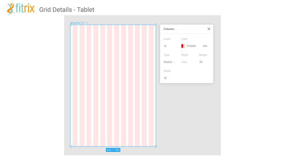
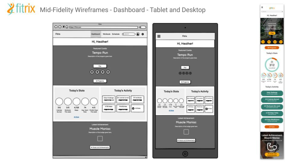
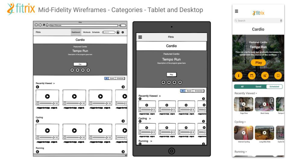
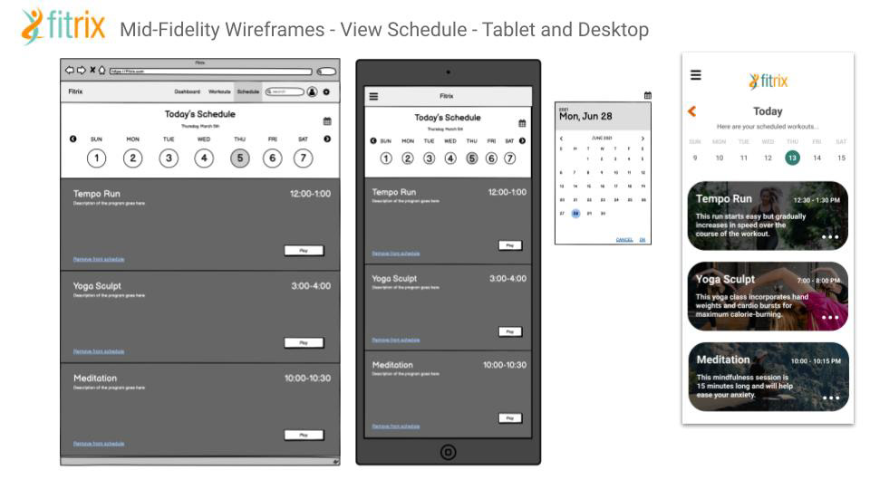
Designing for Different Breakpoints
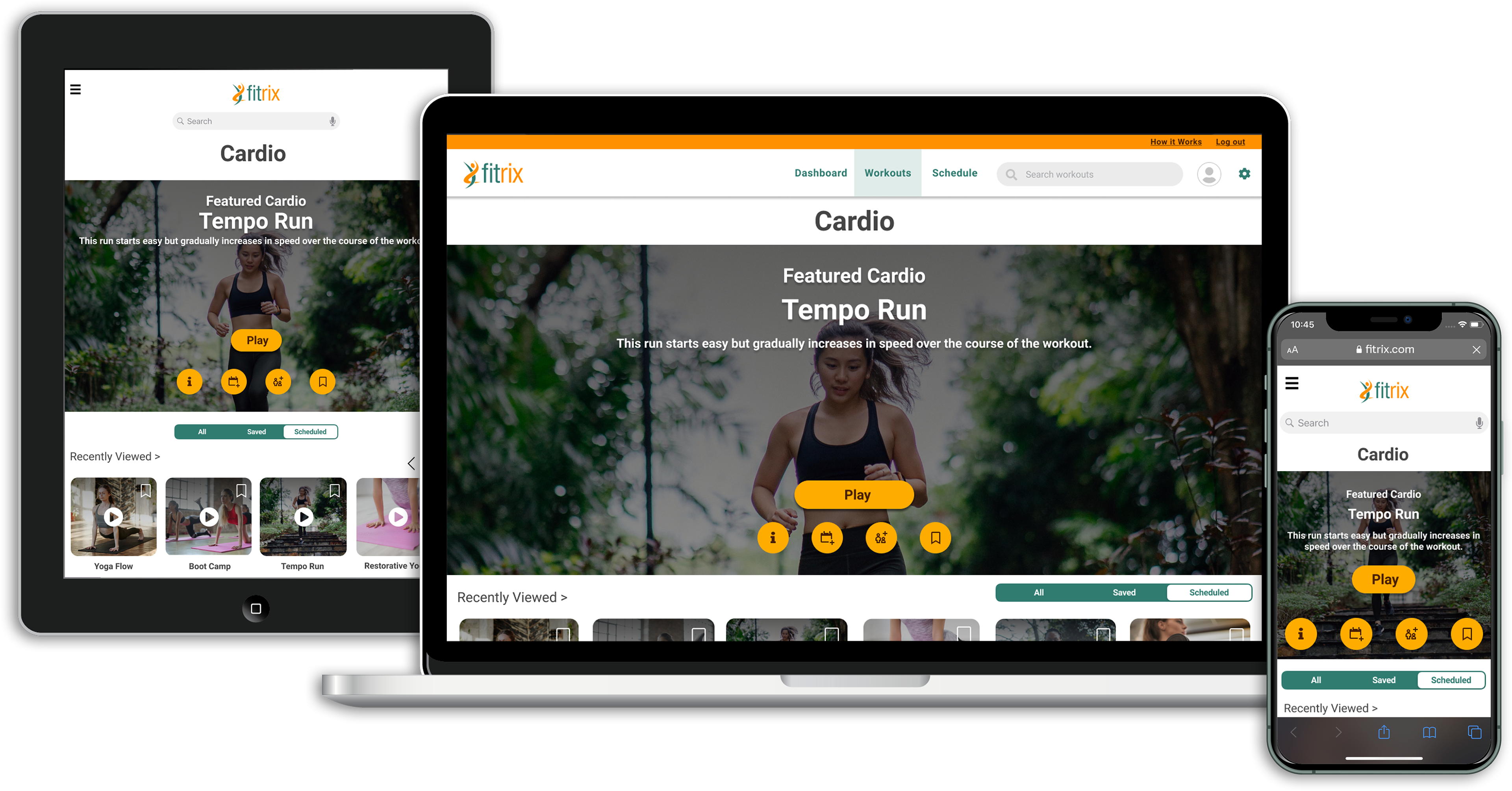
Since Fitrix is a responsive web app, it was important to design for the different breakpoints in the app. Below you can see some examples of my process when creating the grid structure for the three main breakpoints as well as adapting my mobile-first designs to the tablet and desktop versions.
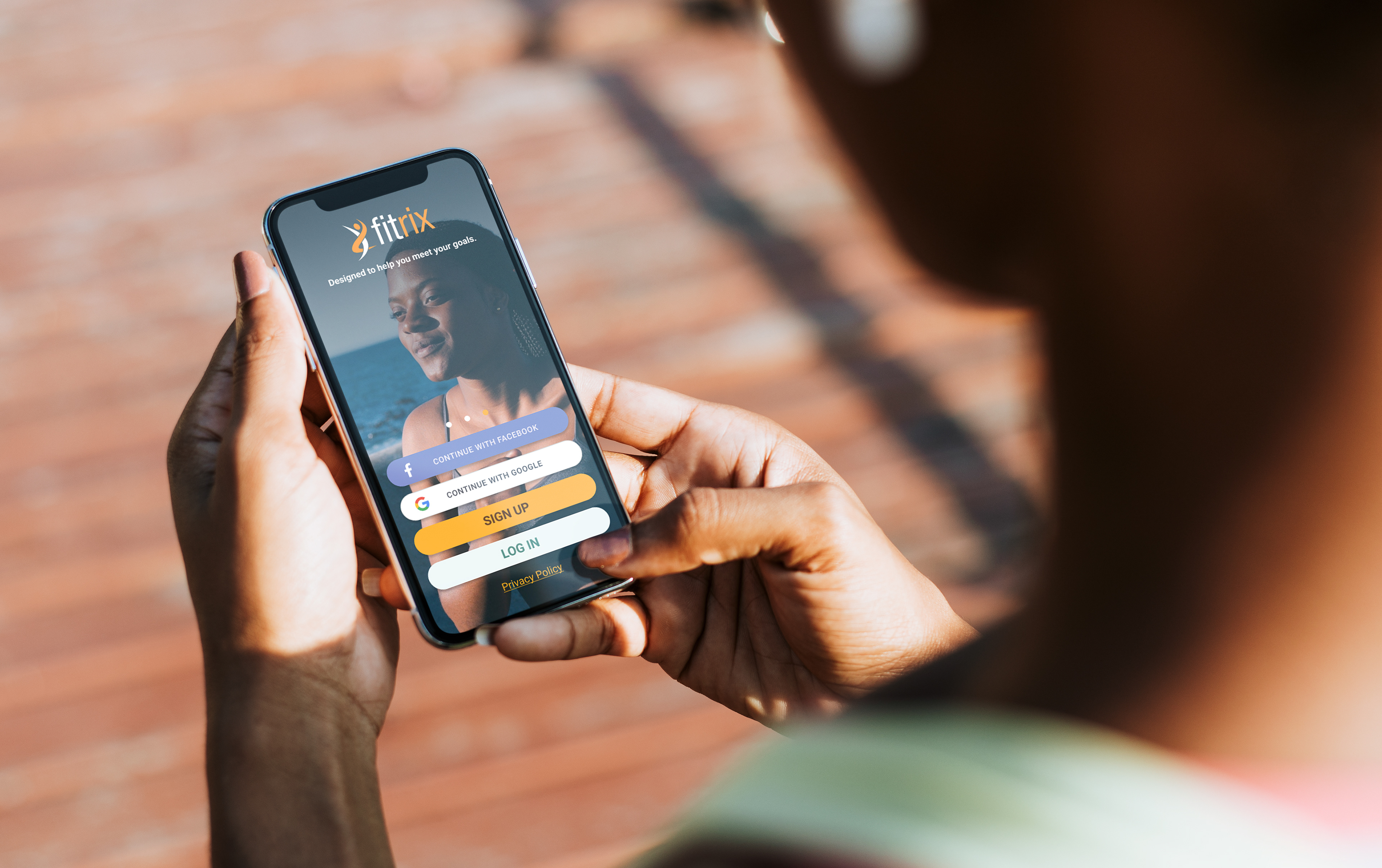
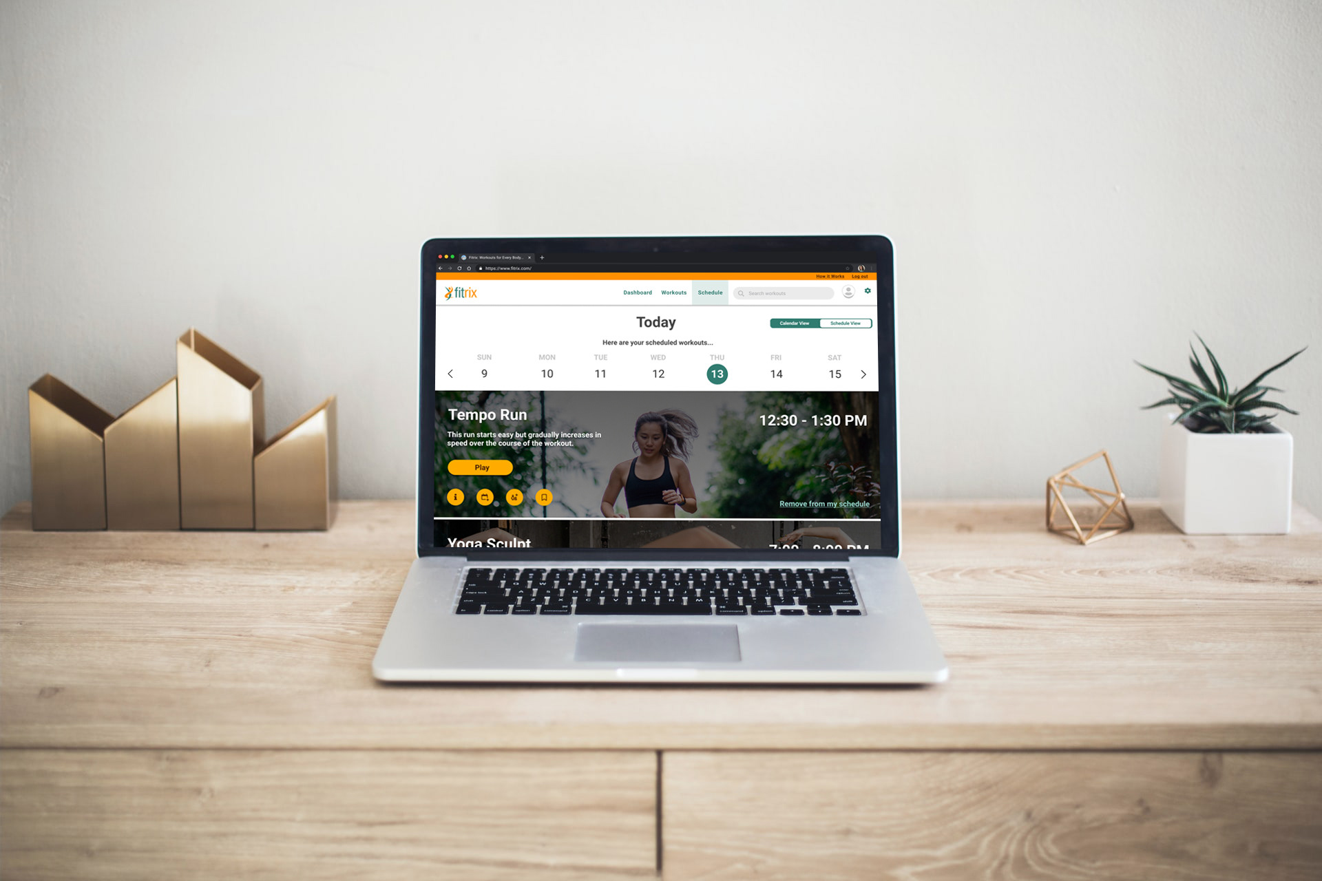
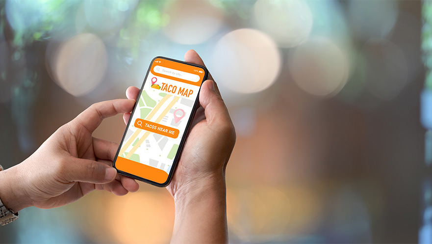
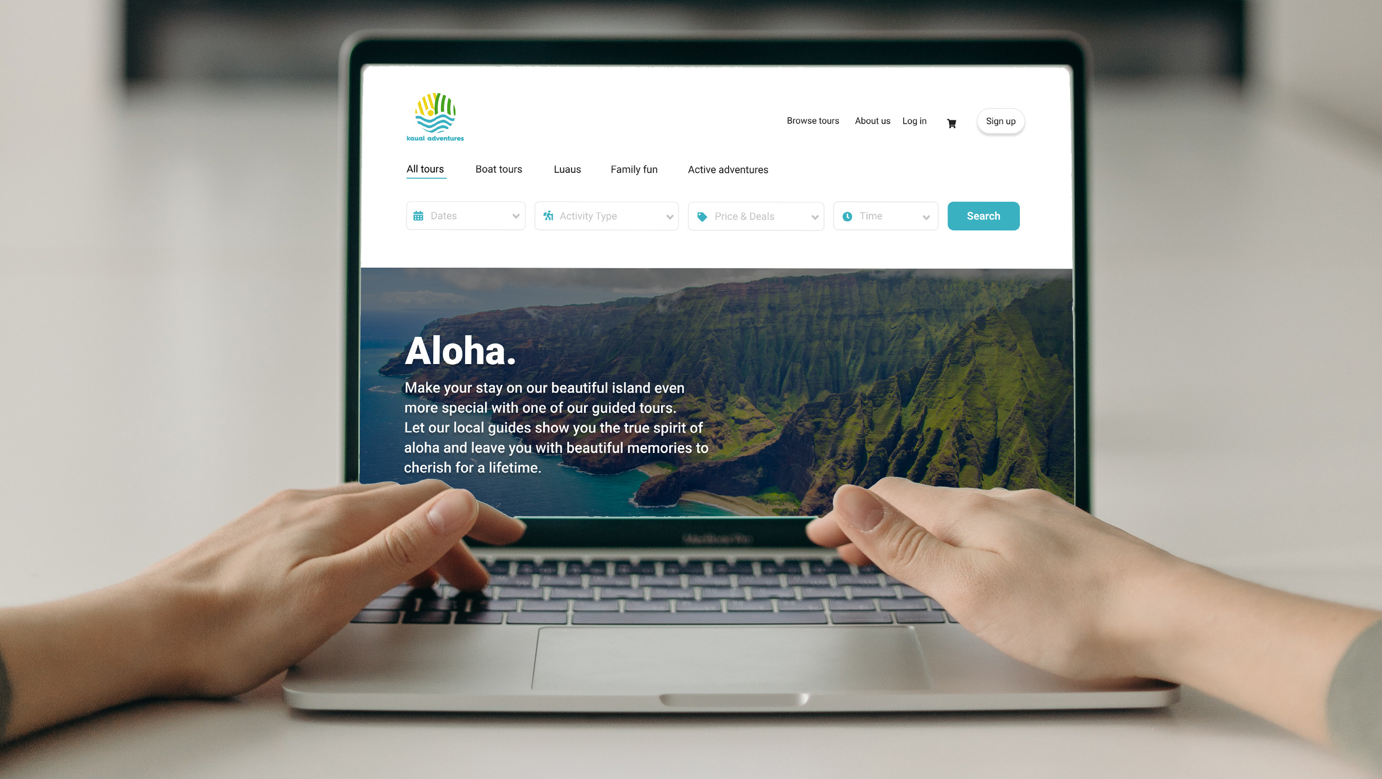
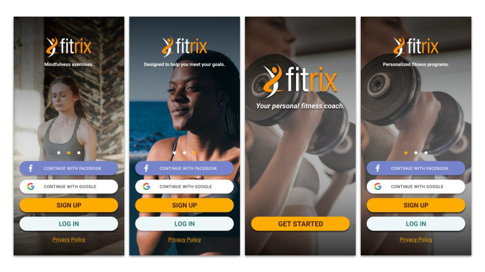
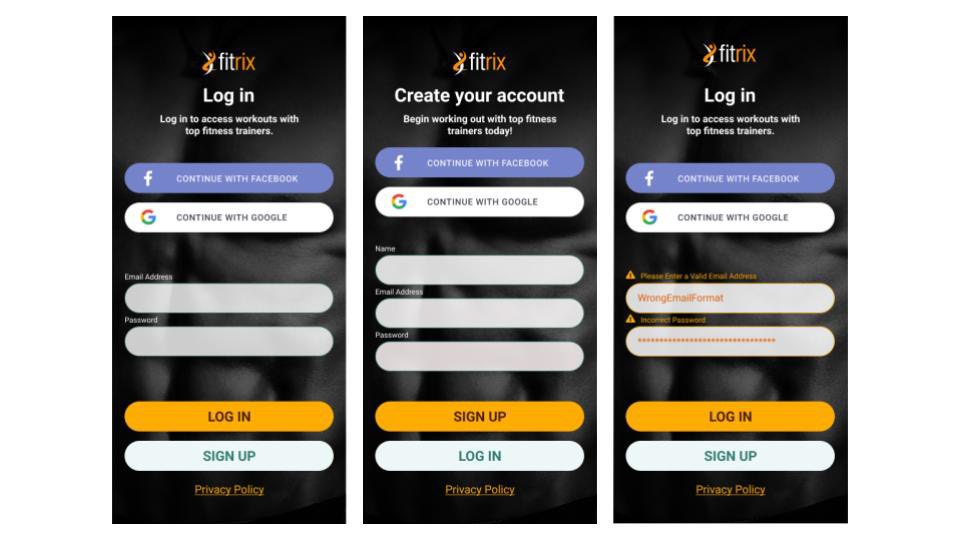
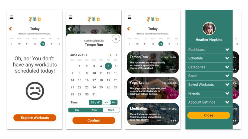
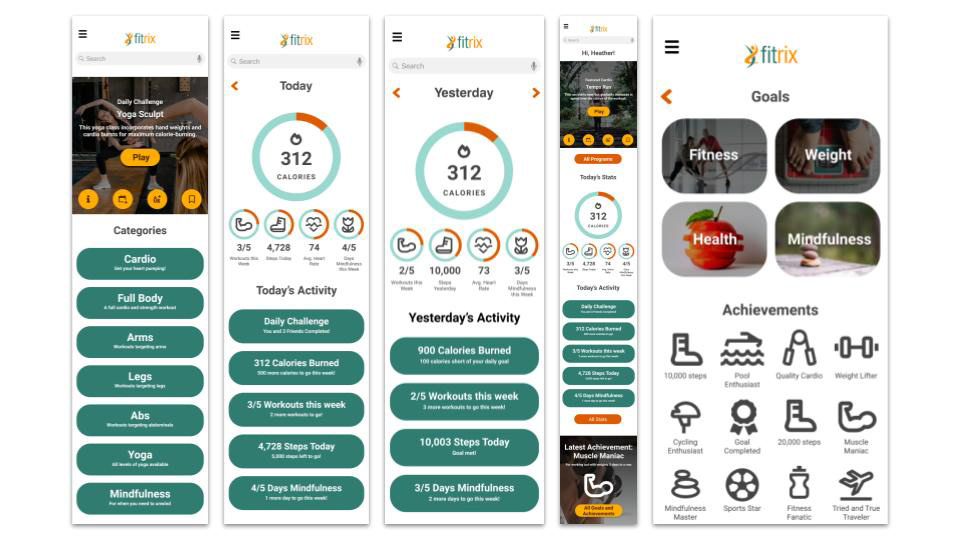
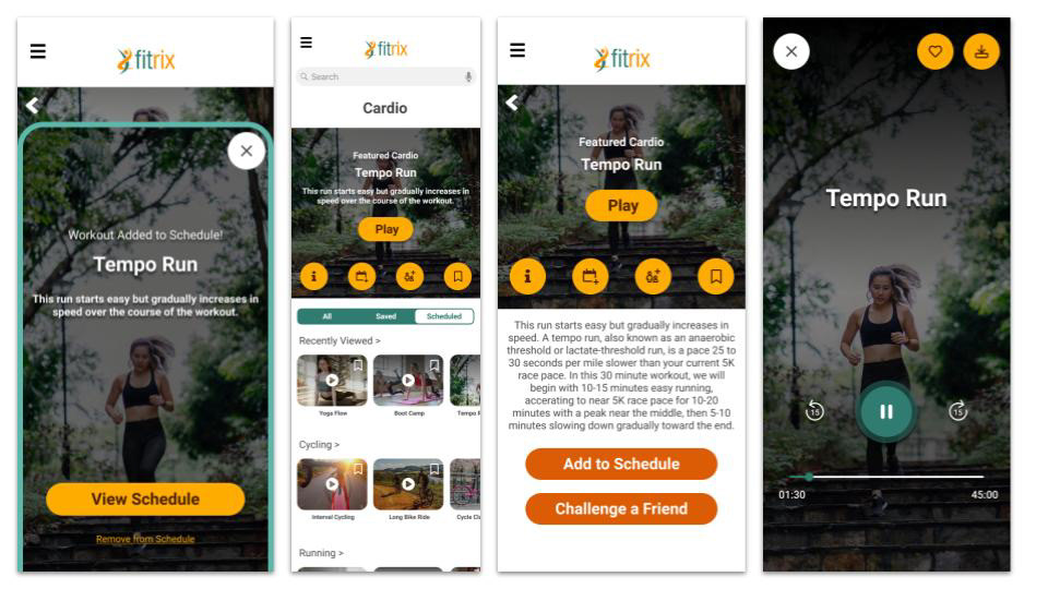
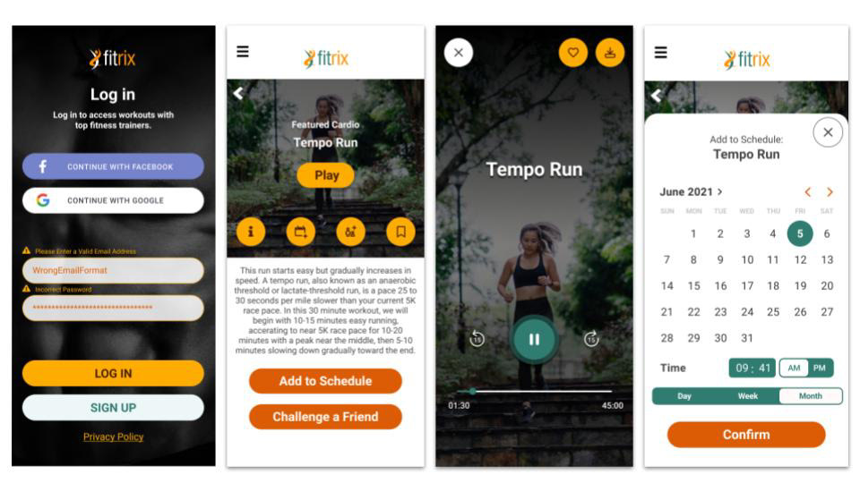
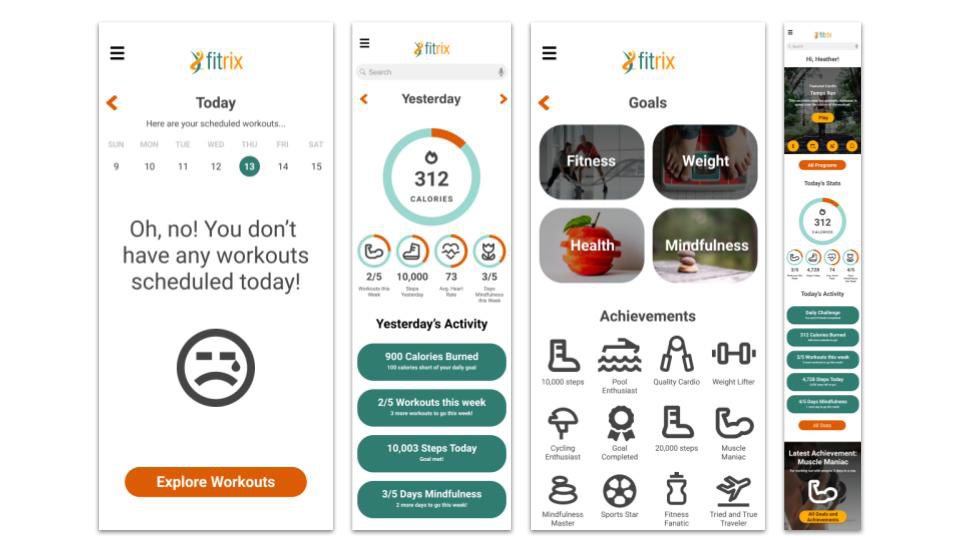
Final Designs
At this stage, my final designs were complete so it was important to place them into mockup templates in order to help with the presentation of the app. Below are a few images I created in order to help Fitrix put it's best foot forward!